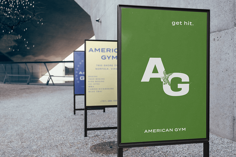
American Gym Branding – A Retro Americana Reimagining
This branding project was created for a unique gym located in Norfolk, VA, an area steeped in military tradition, where the ethos of the gym revolves around physical empowerment for all. The concept draws inspiration from a timeless Americana aesthetic, blending elements of 80s neon, 60s retro script, and 90s minimalist avant-garde design. The result is a bold, eclectic brand identity that speaks to both nostalgia and modernity.
The gym’s motto, "Get Hit," reflects its no-nonsense attitude and commitment to pushing boundaries, while embracing a welcoming atmosphere for anyone, regardless of age, background, or fitness level. The space itself is a raw, open warehouse with exposed brick walls that serve as the perfect backdrop for a mix of graphic elements and vintage decor. Wall graphics include bright neon 80s-style decals, paired with the flowing elegance of 60s retro typography and the clean, bold lines of 90s minimalism. These visuals create a dynamic tension that reflects the gym's mission to offer a space where people can challenge themselves and find strength, no matter their starting point.
Additional deliverables for the project include playful stickers, designed to add an extra layer of fun and personality to the brand experience. The gym’s decor is anchored by black-and-white athlete poster prints, vintage sports gear, and old NFL memorabilia, all of which contribute to the gritty, nostalgic feel that permeates the space. Every design choice was made to enhance the gym's open, inclusive atmosphere, where movement and fitness are seen as essential parts of life for everyone, no matter their profession, creed, or class.
This project was an exercise in balancing contrasting design eras to create something both timeless and fresh, while remaining true to the gym’s core values of community, strength, and resilience.


