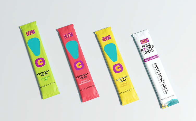
CELL YEA! – Everyday Stick Packaging Design
DESIGN BY PIXELAIN
CELL YEA! – Everyday Stick Packaging Design
Project Overview: The Everyday Stick line for CELL YEA! features energy-boosting supplements designed for on-the-go lifestyles. The task was to create distinct, vibrant sachet packaging for each ingredient variant, reflecting both the unique benefits of each formula and the brand’s dynamic, high-energy vibe.
Design Approach: Each stick pack design is crafted to be visually engaging, with unique color schemes and graphic elements that represent the specific ingredients and benefits, making each variant easy to distinguish. The typography is bold and clean, emphasizing the “Everyday” convenience of these supplements while aligning with CELL YEA!'s energetic branding.
Color & Aesthetic: A vibrant color palette is used to convey the lively essence of each supplement. Each stick pack is color-coded to reflect its key ingredient, making it both functional and appealing to the eye. The aesthetic combines modern design with playful elements, aiming to catch attention and inspire energy.
Result: This packaging design delivers a fresh, appealing look for CELL YEA! that makes each Everyday Stick easy to grab, enjoy, and recognize. The designs effectively capture the product’s functionality and appeal to active consumers seeking convenience and variety in their energy-boosting routines.
#PackagingDesign #SachetDesign #EnergySupplements #ModernBranding #CELL_YEA


