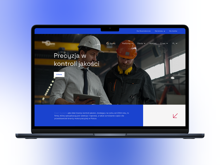
Landing page concept for automotive industry
Hi Everyone 👋🏻
Introducing the landing page concept for a Polish company providing quality control, selection and repair services for components and subassemblies in the automotive industry.
This design is characterized by a clean and minimalist design with an emphasis on professionalism, efficiency and the company's broad field of activities. The color palette consists of shades of blue and gray, with accents of subdued red.
The clarity of the information hierarchy is enhanced by the use of a modern, sans-serif font for headings and main text. The style involves the use of high-quality photography and video to showcase operations, technology and confirm the company's leadership status in the market.
The adopted aesthetic gives a sense of precision and attention to detail, while geometric shapes create graphic structure and balance the page layout.
What do you think? Please let us know in the comment section!Feel free to leave feedback and don't forget to press (L) and don't forget to follow our dribbble account.
Thank you and have a nice day! 🔥
Share your challenges with us - together we will create solutions to attract users!
Contact us now 💬hello@kreatik.pl


