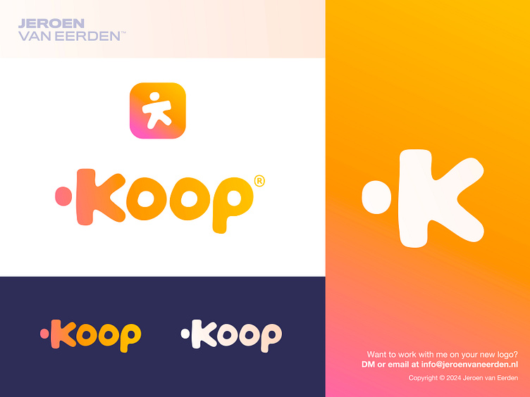
Koop - Logo Design
Koop - Logo Design (webshop)
Koop is a Dutch playful webshop where kids find joy in every product!
It also means 'buy' in Dutch. Applied a suiting gradient to give a fun an playful vibe. I went a bit more 'custom' in designing this word mark and I really enjoy this positive and energizing outcome.
Concept ingredients:
Letter K - Human/Kid - Playful
Happy to hear your thoughts on this logo word mark.
Need a (new)logo for your business? 🚀
Feel free to reach out via Dribbble DM or E-mail:
👉 info@jeroenvaneerden.nl / jeroen.design
💼 Connect with me on LinkedIn / Read my Client Recommendations
🎬 Check my YouTube for Logo Tutorials / Learn Logo Design
🔗 Follow me on Instagram / See BTS and New Content
🛒 Buy my pre-made or unused logos from the portfolio
💬 Tweet with me
