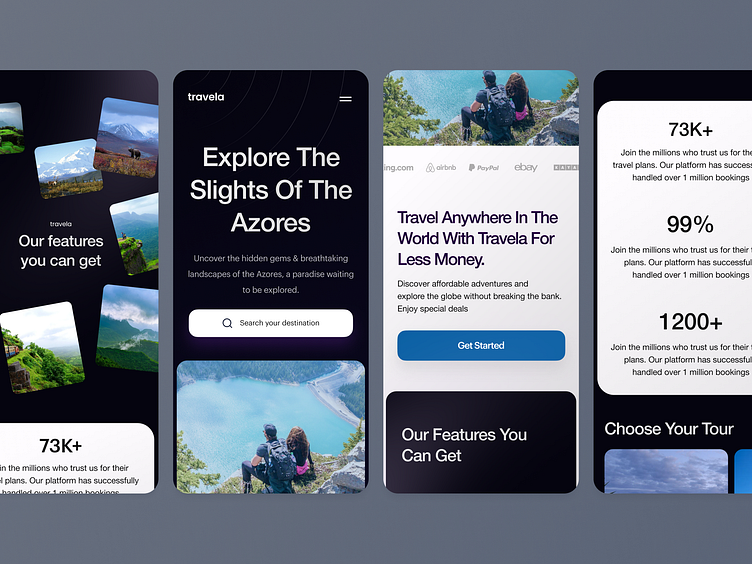
Travela website design exploration
For Travela's mobile design, I focused on a streamlined, traveler-friendly experience. The homepage opens with a prominent search bar, letting users quickly find flights, hotels, or experiences without any fuss. Below that, I added a carousel showcasing top destinations and exclusive deals, so users get inspired right away.
To make navigation smooth, I used a bottom nav bar with essentials like Home, Explore, Bookings, and Profile, making everything reachable with a thumb. The design highlights vibrant travel images to keep the vibe lively and adventurous, while a clean, minimal color palette makes sure everything stays intuitive and easy to explore.
More by Hilf al Digital View profile
Like
