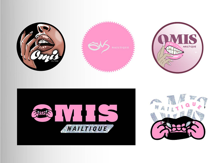
WIP- Y2K/CLEANGIRL LOGO
BRIEF
Client in need of a logo/instagram profilephoto for represent her nail & teethgem business.
Attracting customers who love the "cleangirl" aesthetic with the "insta baddie" aesthetic.
She is all for making them feel like they are in 2000-2010. Since she recently opened the teethgem part, she wants to have an illustration that shows both the teethgems and the nails.
It's sketching time!
In search of the right font...
With an idea in my head on what would fit the Y2K aesthetic and her wishes, I tried to include fonts that have both a thicker, bubbly cute girly fonts, with some clean fonts, calligraphy and minimalistic fonts. I concluded that the thickest round fonts would be mostly fitting for the y2k aesthetic.
Stage 1: Rough Concepts
I wanted to create some with a golden ratio, one of a thicker y2k style (think of hello kitty), some obvious combo of a mouth with teethgems and long nails using a fitting font combination. In the two fonts (the simple black vertical and pink horizontal logo) resemble the japanese aero frutigo style that is very trendy, sort of sporty. I wanted to combine the name OMIS into one object, where u can sort of see the name in it but yet see it as some kind of signature. In the black square I tried to create a design where its stylish in a sense and bubbly way of coming out of the font, showing the mouth and the nails.
Stage 2: Different styles of s1
Designing it to be more cleaner looking- the left row i tried to create the thick, bubbly girly y2k style and on the right i tried to keep a combination of CLEAN-vogue ish in combination of that baddie y2k illustration used similarly on the left. On the top right, i thought of the combination of how to create in one setting the lips and nails at once: then i imagined how slime/water drips that it can be made to look like a hand, to show both sides in one go.
Stage 3: Stick to client's wishes
Here we sticked to the original background my client wished for. She loved the realistic/cartoon type of illustrations just like in the example. Most right, i attempted to create a new signature mark where i combine the O & M to make it look like lips, I & S on top for a signature look. A simple, clean look. I tried to reincorporate the clouds while in style of the lips and hand.
Stage 4: More realistic tweaking
Client wants the logo to show more realistic features, including warm colors. Pay attention to more details. She really wants the face to be more zoomed in, here it was very important for me to be sure that there is contrast for readability, aesthetic in sight but also a proper composition to show where the attention goes to. This took some puzzling.
Stage 5: Work In Progress!
We are cleaning things up, stay tuned to see the new look!


