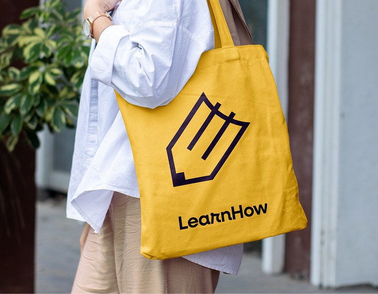
LearnHow — logo and brand identity
LearnHow is an educational platform offering a wide range of creative and motivational learning aids. They specialize in diplomas, stickers, educational posters, and custom decorations designed to inspire and engage learners of all ages. With a focus on quality and versatility, LearnHow provides resources that cater to schools, teachers, and parents, helping make the educational experience more interactive and enjoyable. Their products support the development of essential skills while adding an element of fun to learning.
—
For LearnHow I've created visual identity that reflects the high quality of the educational materials produced by LearnHow. This branding system enhances the brand’s professional image while making future graphic design projects more efficient and consistent. The cohesive visual identity emphasizes creativity and approachability, supporting the company’s mission to inspire and engage learners.
Scope of work:
– Redesign logo
– Brandbook
– Design of identification elements
– Social media templates
– Framework for creating dedicated illustrations
The educational materials created by LearnHow are designed to promote learning through play and exercises. This approach led to the natural idea of combining a book and a pencil, symbolizing the connection between knowledge and creativity. This inspired the creation of a simple yet multifaceted logo that captures the essence of LearnHow’s mission.
The color palette and graphic elements used in LearnHow’s visual identity are inspired by simple shapes and vibrant colors often found in toys for young children, especially those rooted in the Montessori approach. This design choice reinforces the playful and educational nature of the brand’s materials.
To enhance visual identity, I've created a set of simple, geometric shapes. These elements can be used as a background or to design advertising and promotional illustrations, adding a cohesive and playful touch to the brand’s visuals.


