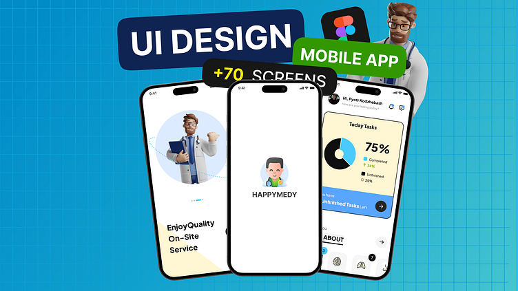
I Designed a Doctor Appointment Mobile App for StartUp
🎨 Designing a Healthcare Mobile App UI-UX for a Startup! 📲 | UI-UX Design Insights, Tips & Walkthrough Hello, design enthusiasts! 🌟 In today’s video, I’ll be taking you through my design process for a healthcare mobile app I crafted for a startup. This app is all about simplifying doctor appointments, task management, and health tracking – all in one sleek, user-friendly interface. 🤩 We’ll dive deep into UI-UX design principles I used, from onboarding 📝 and user-friendly navigation 🔍 to seamless appointment booking 📅 and messaging features for easy communication. I’ll share insights on reducing friction in sign-up flows, organizing tasks, and creating intuitive doctor profiles to improve user engagement and accessibility. Whether you’re a beginner looking to learn app design, a designer aiming to level up your UI-UX skills, or a startup founder interested in mobile app UX, this video has something for everyone! 🎥✨ 💡 Topics Covered: Best practices for healthcare app design 🏥 Creating simple, effective onboarding flows 💬 UI-UX for task management & scheduling ⏰ Building intuitive doctor profiles and appointments 🩺 Integrating messaging & notifications 📲 Don’t forget to like, subscribe, and hit the bell icon 🔔 to stay updated with more UI-UX tutorials, design insights, and walkthroughs!
