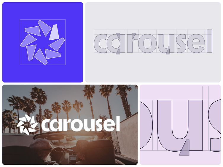
Carousel Logo
More from Carousel's rebrand our team worked on earlier this year. We explored a lot of marks that reinforced the idea of a carousel without being too literal. Below are some other marks we explored. Each had some merit but lost out for one reason or another.
With the logotype, we noticed an opportunity to match the unique notches on the letterforms with the shapes that make up the mark. This created a nice marriage between the logotype and the mark.
✌️Do you have a project in mind? We’d love to hear about it. Get in touch here!
More by Heyo View profile
Like

