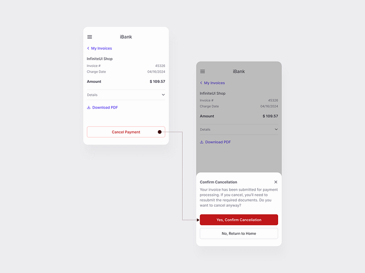
Destructive Buttons Hierarchy
Back again with a new design system shot!
Testing the hierarchy for destructive buttons here. The outlined button prompts initial confirmation, while the filled one is used for the final step, emphasizing the gravity of the action.
Let me know your thoughts on the hierarchy and visual emphasis—and don’t forget to press "L" if you’re enjoying this exploration!
More by Ekaterina Motyleva View profile
Services by Ekaterina Motyleva
Like
