E-Commerce Mobile App
💌 Have a mobile app idea? We are available for new projects!
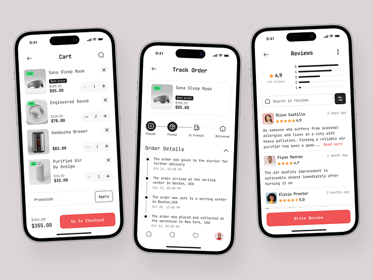
Hello everyone! Our team has recently developed a design concept for a mobile marketplace app. Let's explore the key features and design elements.
The design showcases three main screens of the mobile app: the cart screen, the product reviews screen, and the user account section, where users can track their orders.
For this concept, we selected a black-and-white color palette with a striking red accent used to highlight buttons and other crucial interface elements. This choice ensures a clean, modern aesthetic while effectively guiding user attention.
A key characteristic of this design is the emphasis on product photos. The surrounding design is intentionally minimalistic, ensuring that users remain focused on browsing and selecting products without unnecessary distractions.


