Mobile App Landing Page
💌 Have a website idea? Let's bring it to life together!
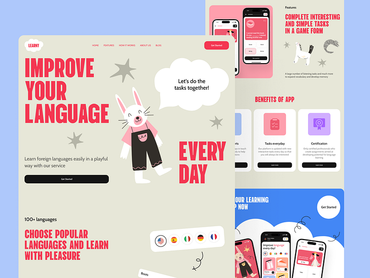
Hello everyone! Our team recently completed a design concept for a landing page promoting a mobile language-learning app for children. Let's take a closer look at the design features.
The landing page includes a catchy slogan and prominent CTA buttons. It also features a section with the app's benefits, a detailed description of its features, and a dedicated page showcasing all the different screens alongside an additional CTA.
The color palette for this landing page mirrors that of the app itself, incorporating pink, blue, and white to maintain a consistent style.
The primary characteristic of this design is its bright and friendly aesthetic, adorned with charming illustrations that emphasize its suitability for children. This approach ensures that kids and their parents find the app inviting and enjoyable.


