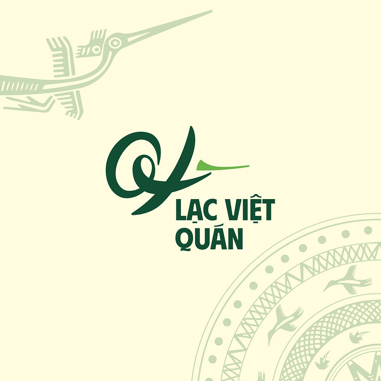
LẠC VIỆT QUÁN | LOGO DESIGN & BRAND IDENTITY
The Lac Viet Quan restaurant brand was born with the mission of bringing customers delicious, pure Vietnamese dishes, encapsulating the quintessence of Vietnamese culinary culture through each dish. Each meal at Lac Viet Quan is not only a taste enjoyment but also a journey to discover the traditional, familiar and unique beauty of the homeland.
The Lac Viet Quan restaurant brand identity designed by Bee Art uses two main colors, green and beige, in many different shades. These two tones help evoke a close and sophisticated space, bringing the image of nature and elegance, expressing familiarity and warmth for customers to experience the cuisine here.
The Lac Viet Quan brand logo is designed with a sophisticated combination of the letters Q, X and the image of the Lac bird, not only bearing the mark of Vietnamese culture but also creating an impressive and unique highlight. This symbol represents the traditional spirit mixed with modern creativity, helping customers easily identify and connect with the brand.
-
Client Lạc Việt Quán
Logo Design Project. Logo is designed for Vietnamese Restaurant.
Copyright© Bee Art. All Right Reserved
Contact us:
• Hotline/ Zalo: (+84) 77 34567 18
• Email: info@beeart.vn
• Website: www.beeart.vn
• Facebook: https://www.facebook.com/BeeArt.vn


