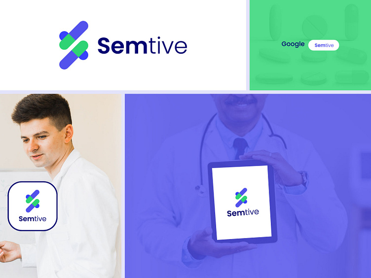
S letter logo design for a healthcare company
S letter logo design for a healthcare company
Client: Semtive Healthcare Company
Industry: Healthcare
Design Concept: Letter "S" with a checkmark and heart symbol
Color Palette: Tealish Green and Warm Blue
The healthcare company approached us to design a unique logo that would convey trust, care, and professionalism. They wanted a design centered around the letter "S" (representing their brand name) while incorporating elements of health, positivity, and compassion.
Design Goals
Trust and Reliability: The logo should establish the brand as a trustworthy healthcare provider.
Positive Symbolism: The use of a checkmark conveys positive outcomes and assurance, crucial for a healthcare-focused brand.
Heart Symbol: A heart shape was requested to emphasize the company’s commitment to patient care and well-being.
Professional Appeal: The colors chosen needed to reflect both warmth and professionalism, appealing to a broad audience.
