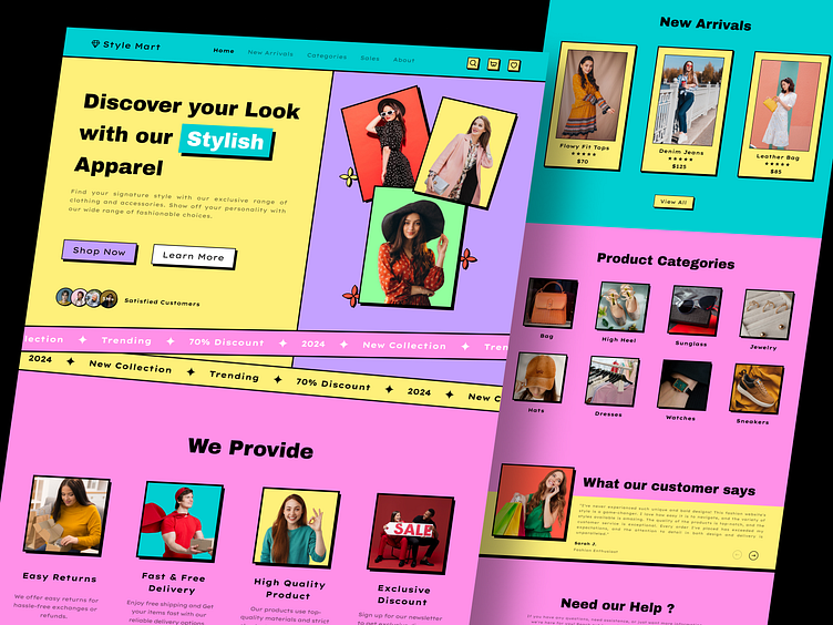
Fashion Websites Landing Page - Neubrutalism Style v2
Hey, Dribbble community! 👋
I'm excited to share the full landing page design of my latest Fashion Website project, created with a bold Neubrutalism style! This is an extended look beyond the hero section, diving deeper into the user journey with seamless navigation and striking visuals.
🌟 What’s Inside the Full Landing Page:
Hero Section: High-impact design to captivate from the first glance.
New Arrivals: Highlighting the latest fashion trends, with vibrant, eye-catching visuals.
Product Categories: Organized and intuitive, making it easy for users to find exactly what they want.
Customer Reviews: Real, authentic feedback for added trust and social proof.
Call-to-Action: Clear CTAs guiding users smoothly through the purchase journey.
🔍 Fresh Upload: This is the full-page design—check it out for a comprehensive view and let me know your thoughts! Hit "Like" if you’re into this bold, fresh design style and want to see more. 🚀
👇🏻 Find Me on 👇🏻


