NWT SPCA Brand Refresh
NWT SPCA Brand Refresh Concept 2
Role: Designer
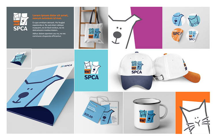
Project: To refresh the current NWT SPCA brand, creating a more positive relationship with the target audience, the community, and the NWT SPCA.
Within the logo, the shapes reference windows. The shapes and configuration are meant to be slightly askewed and imperfect, they convey a quirkiness and warmth that is both friendly and fun. These are all words that describe the many varied cats and dogs of the NWT SPCA.
Based on the dog icon within the existing NWT SPCA branding, this slightly refreshed version is happily "poking" its head out/around a window, door, corner etc. The tilted head is a common characteristic of dogs and is genuinely playful and endearing to animal and dog lovers alike.
The ear "poking" out beyond the shape is meant to imply an openess. The dog is not stuck or contained, it is free to be itself, to be playful (the opposite of what many people associate with kennels or SPCAs in general.)
Like the first concept, my bias shows. Being a volunteer dog walker at the NWT SPCA is a privilege because I get to know and love the many dogs there (cats are loved, too! Just not by me, as I am allergic.) I hope my love shows through in this concept.


