Design System Testing
Hey Dribbble! 🎉
Another day, another shot! I'm continuing to refine an upcoming design system.
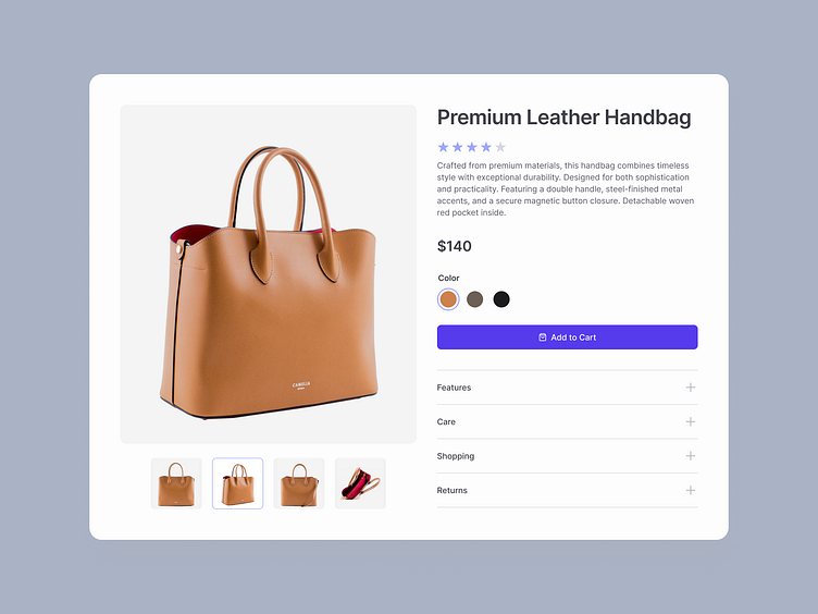
This product card serves as a testing ground to explore button styles, color contrasts, and layout, with a focus on accessibility.
Let me know your thoughts on the hierarchy and clarity, and don’t forget to press "L" if you’re feeling it!
〰️
I’m a former corporate banker turned UX/UI designer, creating simple and effective solutions for various industries.
♥️ Do not hesitate to connect with me on LinkedIn:
More by Ekaterina Motyleva View profile
Like
