Solidbase – Logo & Brand Identity Design
Solidbase
⠀
Solidbase is a modern construction company focused on high quality, reliability and innovation. The company uses advanced technologies and environmentally sustainable solutions to create durable and long-lasting objects.
Solidbase builds its reputation on three key principles: quality, reliability and responsibility to the client and the environment. The company is focused on maintaining high standards and attention to detail, which makes it a reliable and responsible partner in construction.
Task:
⠀
Before starting work on the project, the task was to create a logo and corporate style that would visually convey the strength and stability of the brand. It was necessary to develop a strict but memorable image of the company that would inspire confidence and be associated with a modern approach to construction.
Process:
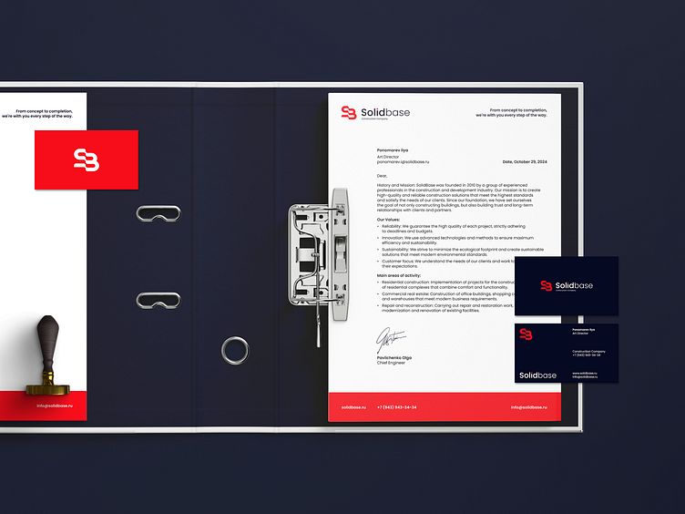
At the stage of logo development, the main focus was on creating a unique corporate sign. The letters "S" and "B" were connected, forming a minimalist sign reflecting the reliability and unity of the company. Smooth lines in the sign soften the strict and solid image, adding modernity and emphasizing flexibility in design.
⠀
Vivid red and midnight blue were chosen as the main colors. The color palette combines professionalism and the modern spirit of the company, creating a balance between dynamics and stability. Additional colors - deep black and white - add rigor and clarity.
⠀
The Poppins corporate font was chosen for its clean, geometric shapes and modern style, which perfectly reflects the professionalism and minimalism of the brand.
Result:
⠀
As part of the project, a logo and corporate identity were developed, including the design of business documentation, advertising materials, social media design and other corporate identity media. The final result presents Solidbase as a strong, confident and modern brand that reflects the company's key values.


