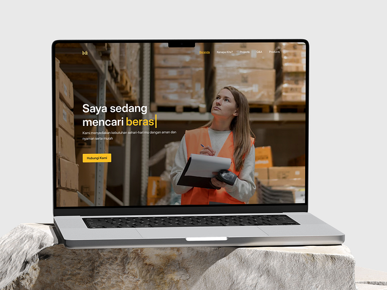
Merantau Mandiri - FMGC landing page website
Hello Dribbbles 🏀
I'm excited to share my latest work of Merantau Mandiri - FMGC landing page website that I doing last month. If you like please like and share ya ^^ Thank you. Work date (Oct, 2024)
So, let's check this out this work!
Challenge 🌪️
Design a dark-mode website for an FMGC logistics company, using a modern layout that combines streamlined navigation, responsive grids, and minimalistic design elements. The dark theme should feel professional and sleek, emphasizing both the technology and efficiency in the logistics sector. The layout should incorporate clear visual hierarchies to help users find their needs.
Focus Points:
Use a monochromatic or muted color palette that complements the dark mode, with bold accent colors for buttons, links, or important call-to-action areas.
Apply visual depth through subtle shadows and gradients to create a high-end, dynamic look.
Ensure all text remains legible in dark mode, with good contrast ratios and appropriate font sizes for readability.
Emphasize logistics themes in visuals, like using icons for services, transport routes, or warehousing representations.
Full Preview
❤️ Love this project? Show your appreciation with a like! Thank you for your support!
We are available for an small - medium - or Bigger project and similar niche projects which have connection with your user and business matrix approach. Sounds good? Call now.
Want to collaborate? Email us: jujutsuthecode@gmail.com
----------------------------------------------------------------------------------------------------


