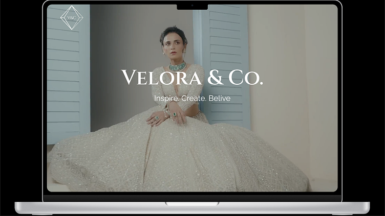
Velora&Co
"Crafting Elegance Online: A Luxe Digital Experience for Velmora Jewelry"
Objectives
Showcase Jewelry Elegance: Use design to convey the premium quality of Velmora’s pieces.
Boost User Engagement: Enable easy exploration of collections and quick access to product details.
Drive Conversions: Design a frictionless path to purchase, focusing on simple navigation and clear CTAs.
Establish Brand Cohesion: Ensure the UI aligns with the brand’s identity and appeals to luxury shoppers.
Process
1. Research and Inspiration
To set the foundation, I conducted research focused on:
Luxury E-commerce Trends: Studied top luxury jewelry brands to identify trends that resonate with high-end consumers, such as rich color palettes, large visuals, and a minimalist yet elegant layout.
User Expectations: Noted that the target audience values both visual appeal and ease of navigation, especially when exploring premium products online.
Competitive Analysis: Analyzed competitor sites to identify unique opportunities for Velmora to stand out, focusing on an immersive product experience.
2. Wireframing
I began with low-fidelity wireframes to structure the core pages:
Homepage: Focused on a hero banner with large, captivating imagery and quick access to new collections.
Product Page: Designed layouts that offer ample white space around images, allowing the jewelry to stand out.
Checkout Flow: Simplified into a few intuitive steps, ensuring a quick yet luxurious experience.
After presenting wireframes, I refined based on feedback, particularly enhancing the navigation flow and product page hierarchy.
3. Visual Design
Color Palette and Typography
Colors: Selected a palette of deep jewel tones, using gold accents and deep greens to evoke luxury and sophistication.
Typography: Chose a mix of serif fonts for headings (to convey class and elegance) and sans-serif for body text, optimizing readability without compromising style.
Product Display and Imagery
High-Impact Images: Focused on large, high-resolution images to allow users to view jewelry details up close. Each product page includes features like zoom-in, 360-degree views, and close-up shots.
Subtle Animations: Integrated hover effects on product cards and smooth transitions to enhance the interactive feel without detracting from the elegance of the visuals.
Navigation and CTAs
Sticky Navbar: Made navigation always accessible with a sticky navbar, allowing users to explore collections and switch categories effortlessly.
Refined CTAs: Designed prominent yet subtle "Add to Cart" and "Buy Now" buttons, using soft animations to signal interactivity.
4. Prototype and Usability Testing
After creating a high-fidelity prototype in Figma, I conducted usability testing with a sample of target users to gather feedback:
User Testing: Observed how users navigated the site, explored products, and moved through the checkout flow.
Feedback Integration: Addressed pain points like button placement and optimized certain interactions for smoother transitions, ensuring a smooth user journey from start to finish.
OutComes
Visual Appeal: The final design was praised for its elegance and brand alignment, capturing Velmora’s luxury ethos.
User Engagement: The prototype testing showed increased time spent on product pages, as users were drawn to the detailed imagery and smooth interactions.
Conversion-Friendly Design: By simplifying the user flow, especially during checkout, the design reduced potential barriers to purchase.
Reflection and Key Takeaways
Through this project, I strengthened my understanding of designing for a luxury audience, learning to balance aesthetics with usability. Key takeaways include:
Emphasizing User-Centered Design: Knowing what high-end customers value allowed me to focus on visuals, ease of navigation, and elegant interactions.
Iterative Testing: Testing early and iterating based on user feedback ensured the design met both business goals and user expectations effectively.
This project provided a valuable opportunity to create a cohesive, luxury-oriented design that connects with its audience, offering both style and a smooth, memorable experience.
Let’s work together
I'm currently available for new work. Let me know if you're looking for a digital designer. Let’s talk about the next big thing!
This content images is used for educational purposes only. All rights belong to the respective owners. Please contact me for image removal if needed.


