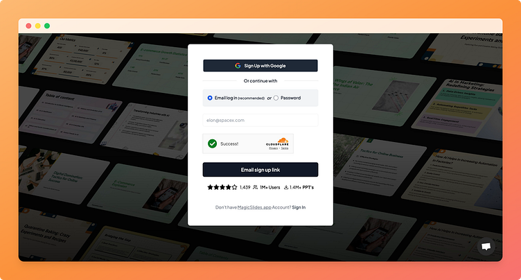
Sign-Up Page with Netflix-Style Grid
Check out this clean, modern sign-up page I designed for MagicSlides.app! Inspired by Netflix, the background grid showcases a curated preview of slides, giving users a dynamic look at what the app offers right from the start.
So previously i have tried showing 3 generated presentation on the side but user was required to go through each to see by default it was showing 3 first slides but this UI offers a view to all kinds of UI that can be generated
The images on the background are randomise so everytime you visit you will see something new.
The Cloud flare Turnstile integration adds an extra layer of security without compromising the flow. This design balances aesthetics and functionality, making the onboarding process as seamless as possible. 🙌
💡 Features:
- Google sign-up and email log-in for quick access 🚀
- Visual grid for a lively, engaging background
- User stats and ratings displayed to build trust ⭐
- Cloudflare Turnstile for enhanced security 🔒 (i am planning on getting rid of the visibility while still have it functioning)
Love this design? Leave a ❤️ and let me know what you think in the comments!
#UXDesign #UIDesign #MagicSlidesApp #SignUpPage #WebDesign #NetflixInspired #CleanUI #UserOnboarding #ProductDesign #AppDesign #Dribbble #ModernDesign #GridLayout #DesignInspiration #SecurityByDesign #PresentationApp #CreativeProcess #MagicSlides #WebAppDesign #Turnstile #DesignDaily #SignIn
4o
