Airline List (Case Study)
Overview
Airline List is a meticulously curated service created by renowned Indie Hacker Pieter Levels. Designed to provide comprehensive information about airlines, airplanes, and airports that isn't readily available elsewhere, it offers a unique resource for travelers and nomads.
The current design of the product presents several opportunities for enhancement. As a passionate designer seeking to practice and refine my skills, I have identified the following key areas for improvement:
Design a New Logo & Brand Identity
Create a new logo and brand identity that better captures the essence of the brand and its product, aiming to elevate its visual appeal and overall presence.
Improve the UI/UX for Rapid & Intuitive Navigation
Revise the UI/UX to enhance navigation, ensuring a more intuitive and efficient user experience that facilitates ease of use.
Remove Visual Clutter & Enhance Visual Design
Simplify and modernize the visual design by removing unnecessary clutter and updating the aesthetics to make the product more engaging and competitive.
Problems
After performing a rigorous UX Audit I found the following problems
- Generic Logo and Brand Identity
- Info Cards are visually overloaded
- Inefficient filter system (does not support rapid navigation)
- Mobile version has clunky UX & lacks proper optimization
-. No search bar
Ideation
I began my research by compiling a list similar and adjacent services to Airline list which includes travel, review & real estate websites. I examined their design patterns thoroughly to find trends and unique visual cues.
Logo & Brand Design
I took a fresh approach to redesigning the logo and brand identity, aiming for a more streamlined, cohesive look that aligns seamlessly with the platform's UI/UX. The new logo combines a stylized airplane icon with the letter "A" from Airline List, creating a modern, memorable mark.
The color palette was expanded beyond the original grey and dark blue, incorporating a lighter blue alongside a vibrant yellow. This combination not only enhances visual appeal but also provides the space and clarity that the brand identity needs to breathe.
For the typography, I chose an extended, industrial-style sans serif font, which reinforces the brand’s sense of openness and professionalism, while also communicating trustworthiness—an important factor given that the founder is a well-respected solo entrepreneur in the industry.
Wireframes
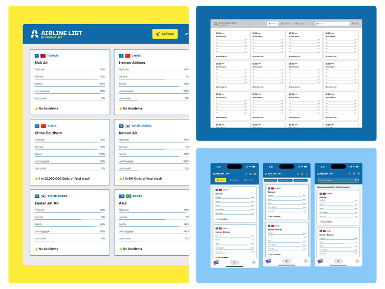
The wireframes serve as the foundational layout for both mobile and desktop versions of the platform, reflecting a design philosophy centered around clarity and intuitive navigation. The structure is intentionally streamlined to ensure users can quickly grasp the platform’s functionality, making it easy to navigate and interact with. The focus was on creating a seamless user experience that prioritizes accessibility and speed, allowing users to find what they need with minimal effort.
Home (Before vs After)
Branding Integration
The new branding was seamlessly incorporated throughout the homepage, aligning with the updated logo, color scheme, and typography for a cohesive visual identity.
Navigation Overhaul
The navigation was streamlined into a more compact, user-friendly layout, enhancing ease of use without sacrificing functionality.
Info Card Redesign
The information cards were reimagined for better clarity and visual hierarchy, making content more scannable and engaging
Search Bar & Filters
A search bar was added for quicker access to content, and the filters icon was repositioned for more intuitive placement within the user flow
Information Architecture Restructure (Mobile)
The information architecture on mobile was restructured for improved user experience, ensuring content is displayed in a logical, easy-to-navigate sequence.
UI Optimization for Mobile
The user interface was specifically optimized for mobile devices, ensuring a more intuitive and responsive design—unlike the previous version, which felt cumbersome on smaller screens.
Cards (Before vs After)
Instant Information Display
Info cards now present key details at a glance, eliminating the need for hover interactions, ensuring users can quickly absorb important information.
Redesigned Information Architecture
The card layout has been restructured for improved readability, with a focus on intuitive hierarchy and ease of comprehension.
Hover Interaction
The hover effect has been simplified to act as a highlighter, drawing attention to key elements without overwhelming the user.
Progress Bar Redesign
The progress bars have been updated with clearer visual indicators, making it easier for users to interpret progress at a glance.
Flag Icon & S/N Refinement
Flag icons and serial numbers have been reworked for a cleaner, more polished look, improving their clarity and visual impact.
Filters (Before vs After)
Traditional Filter System
We adopted a more conventional filter system that’s proven to enhance usability and streamline the user experience, offering a more familiar and intuitive way to interact with the platform.
Removal of Emojis
The emojis were removed to maintain a more professional, clean aesthetic that aligns with the refined brand identity.
Redesigned Filter States
Both active and non-active filter states have been redefined for better clarity, ensuring users can easily distinguish between selected and available options.
Responsive UX
The filter panel’s UX has been optimized to adapt fluidly to different screen sizes, ensuring a consistent, user-friendly experience across both desktop and mobile.
Mobile Filter Panel Optimization
On mobile, the filter panel has been fine-tuned for intuitive interaction, ensuring it remains accessible and functional without disrupting the overall flow of the app.
Search
Search Bar Implementation
A search bar has been introduced to enhance navigation across the platform, allowing users to quickly find content and streamline their overall experience.
Mobile Interaction
On mobile, the search functionality is accessible via a tap on the search icon, optimizing space while maintaining easy access.


