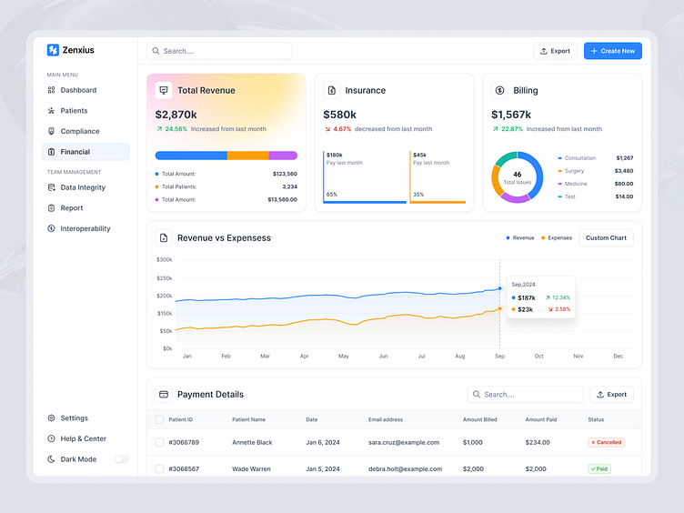
Financial Dashboard Design
Just wrapped up an exciting design for a financial dashboard aimed at making financial insights easy and accessible!
This dashboard provides an intuitive overview of key financial metrics, helping users make data-driven decisions at a glance. Here are some highlights:
✅ Total Revenue, Insurance, and Billing Summary Cards: Users can quickly see changes in revenue, insurance, and billing metrics with clear visuals, including percentage increases or decreases and category breakdowns.
✅ Revenue vs Expenses Chart: A detailed line graph comparing revenue and expenses trends over time, with dynamic tooltips providing deeper insights on monthly performance.
✅ Payment Details Table: A list view showing payment records with essential information such as patient ID, date, email, and payment status, which is color-coded for easy scanning.
Simplicity and clarity were key to this design. My goal was to create an experience where complex financial data becomes easier to understand and act upon, whether users are executives, financial analysts, or team managers.
Would love to hear your thoughts on this approach to financial data visualization!
Let's Start an Awesome Project Together.👇
Get in Touch: halo.minhaj@gmail.com
Contact Me: Skype


