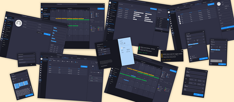
Maestro - A project management and communication desktop app.
Maestro - A project management and communication desktop app.
Xeba Technologies LLC - Internship position
The Maestro desktop app is a dynamic project management and communication system that offers a comprehensive platform for efficient collaboration and organization. It's designed to empower teams and individuals with tools for project planning, task management, real-time communication, and customization.
Challenge
The challenge was to enhance the user experience and functionality of the Maestro desktop app, with a specific focus on the settings module, user profiles, and creating the new "Nugget" (issue) module. These improvements were essential to meet evolving user needs and ensure a seamless and efficient project management and communication platform.
Solution
The primary goal was to create a clean, user-friendly interface that elevates the user experience through:
Simplified Navigation: Streamlined the user journey for intuitive access to key features, creating a cleaner and more accessible interface.
Improved Visual Design: Adhered to the company’s design system for a cohesive look that aligns with brand identity, ensuring a consistent and professional appearance.
Motion and Interactions: Integrated engaging animations and interactions to make the experience more immersive and enjoyable, enhancing user engagement.
My Responsibility
During my six-month internship at Maestro, I had the privilege of working as a UX/UI designer, with a primary focus on elevating the user experience within the settings and profiles modules of the platform.
Information Architecture
We structured The Gray Insurance website into a two-level site map:
First Level: Dedicated to the Gray Insurance Group, featuring essential pages such as contact details, claims processing, and customer portal access. This level provides general information relevant to the entire group.
Second Level: Focused on The Gray Insurance Company’s specific services, offering detailed insights, resources, and support for each insurance service.
This hierarchy enables visitors to easily access both general group information and in-depth service details, creating a seamless and informative user experience.
Wireframing and Prototyping
Wireframing and Prototyping Summary for Maestro Desktop App:
Lo-Fi Wireframes: Designed the app's layout and content placement, focusing on guiding users effectively and enhancing the overall user experience.
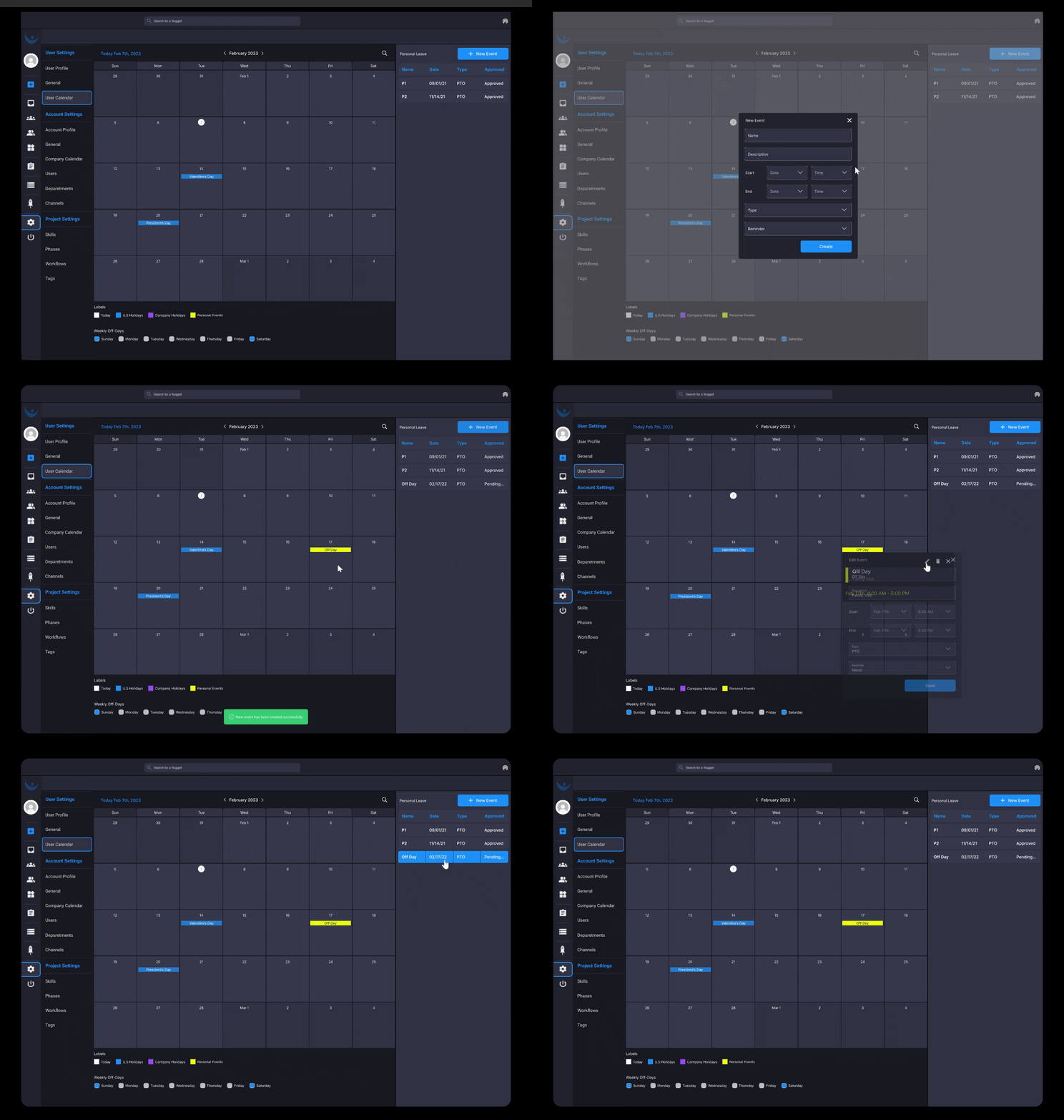
Hi-Fi Wireframes: Redesigned the settings module to improve intuitiveness and customization, streamlining navigation and enhancing user interactions.
Prototyping: Developed interactive prototypes with micro-interactions, creating an immersive, intuitive, and visually appealing experience for users.


