Gray - The insurance company
Gray - The insurance company
Digital Ink Agency
The Gray Insurance Company offers a Self Insured Retention (SIR)/Deductible program of insurance, providing primary coverages for Workers’ Compensation, Maritime Employers’ Liability, Business Automobile Liability, Commercial General Liability, and Excess Liability.
Challenge
The Gray Insurance faced a significant challenge with an outdated website that was no longer effectively serving the needs of its audience. The existing website's antiquated design and functionality were impeding user engagement and hindering brand recognition.
Solution
To address the outdated website, we executed a redesign focused on key improvements:
Enhanced Service Presentation: Reorganized content for clear, accessible information on services and programs.
Streamlined Claiming System: Simplified the claiming process to improve customer experience.
News & Blogs Section: Added a section for updates and insights, increasing engagement.
Improved Location Info: Made branch details easier to find for quick access.
Interactive Agent Map: Integrated a map to help users locate agents nearby, enhancing accessibility.
My Responsibility
In my role designing The Gray Insurance website, I was responsible for:
Information Architecture: Structuring content for intuitive access to insurance services.
Wireframing: Developing page blueprints to ensure a user-friendly layout.
Design: Working with the senior graphic designer to align visuals with brand guidelines.
Prototyping: Building interactive prototypes to deliver an engaging user experience.
Information Architecture
We structured The Gray Insurance website into a two-level site map:
First Level: Dedicated to the Gray Insurance Group, featuring essential pages such as contact details, claims processing, and customer portal access. This level provides general information relevant to the entire group.
Second Level: Focused on The Gray Insurance Company’s specific services, offering detailed insights, resources, and support for each insurance service.
This hierarchy enables visitors to easily access both general group information and in-depth service details, creating a seamless and informative user experience.
Wireframing and Prototyping
Lo-Fi Wireframes: Developed the visual structure and layout for Gray's website in collaboration with our UX writer to ensure user guidance and service emphasis.
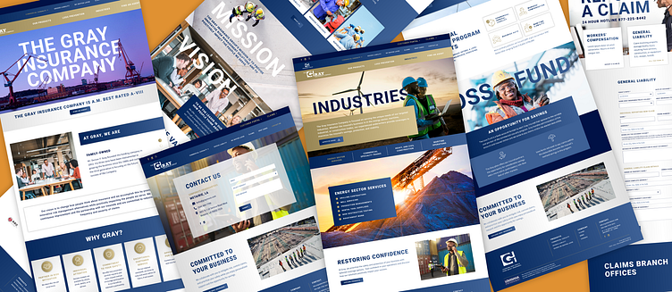
Hi-Fi Wireframes: Led the design process with the graphic designer, using the brand book and research to set the visual tone on the Home page, then collaboratively designed additional pages to ensure brand alignment and a cohesive user experience.
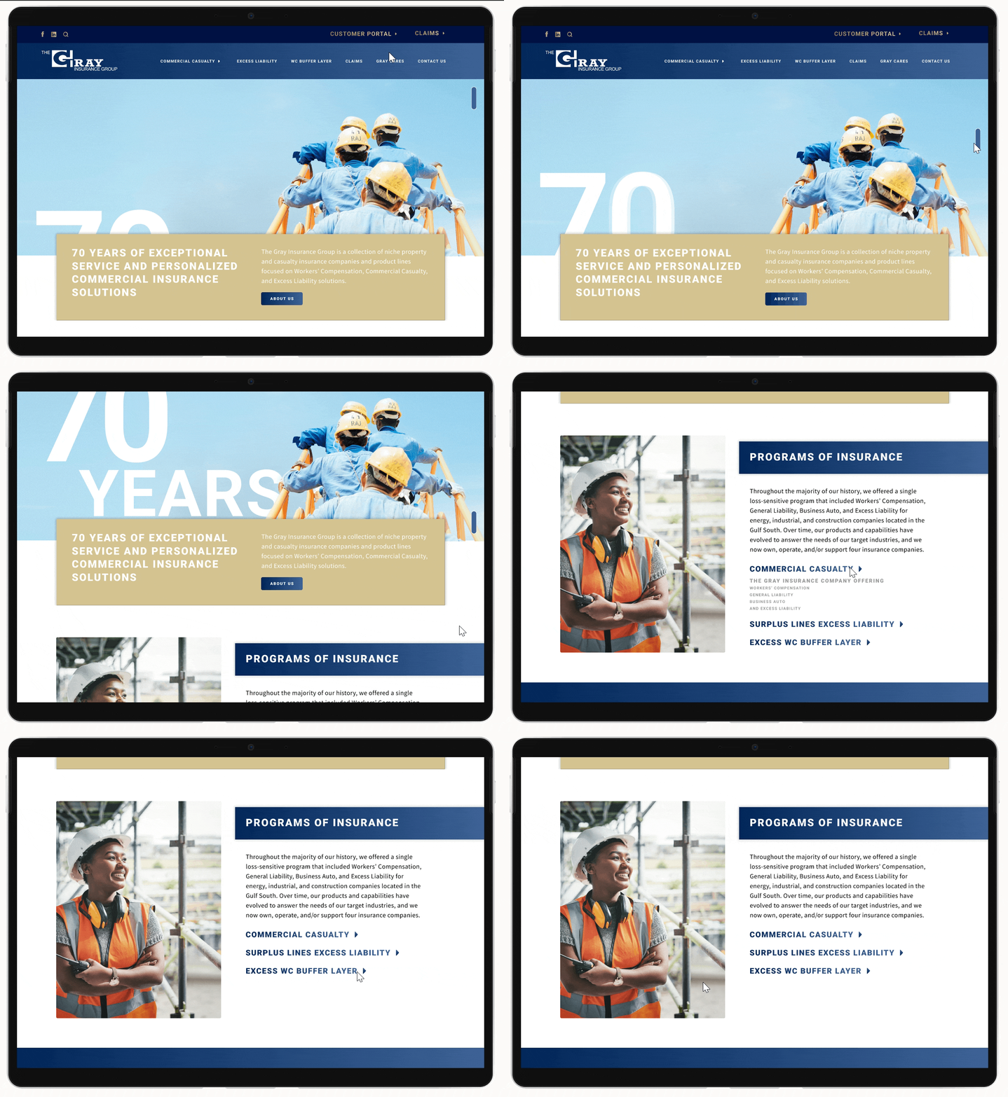
Prototyping: Added dynamic elements like animations, hover effects, sliders, and interactive infographics, focusing on a seamless, engaging experience to enhance visitor interaction on Gray's website.


