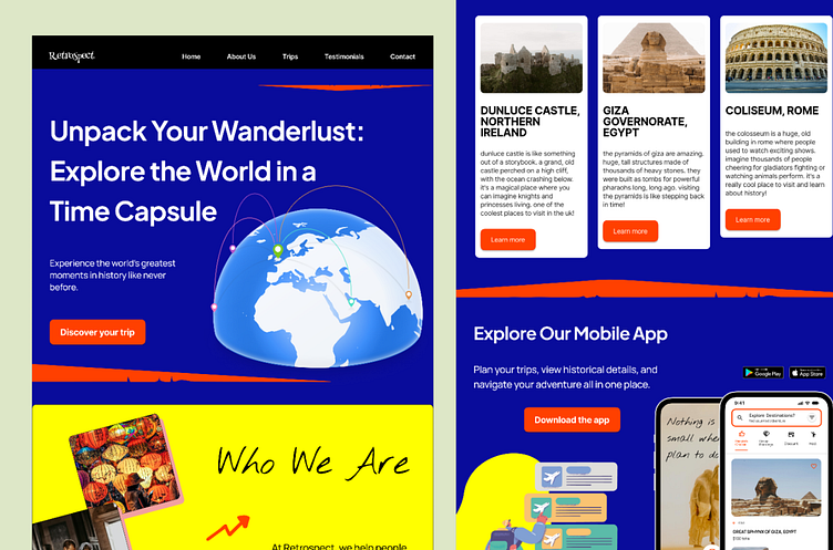
'Retrospect's' Landing Page (Mobile App)
Company name and their goals: Retrospect is a travel app that allows users to discover top travel destinations, curated recommendations, and group booking options.
Design Decisions & Thought Process: My goal through this landing page is to create a sense of adventure in the user. And for that, I chose bold colors like deep blue and bright yellow to capture attention by creating a lively atmosphere that reflects the excitement of traveling the world in eighty days, to be their own Phileas Fogg.
Challenges Faced: One of the main challenges was balancing bold colors usage for readability. Bold colors can sometimes overpower text, so I adjusted contrasts to make sure legibility while playing safe especially in mobile UIs.
Design Details: From typography to elements such as brush strokes and arrows, all were used while keeping in mind modern design principles that aim to draw attention and encourage interaction.


