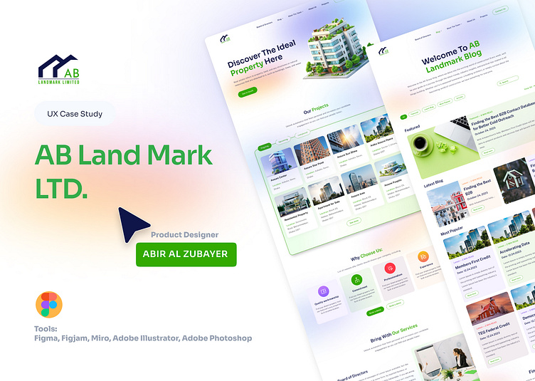
AB Landmark LTD - Real Estate UX/UI Case Study
🌱 Project Overview
This UX/UI design for AB Landmark LTD offers a seamless, user-focused experience for property seekers. The platform’s clean green aesthetic not only symbolizes growth and sustainability but also builds trust, aligning with the brand's commitment to guiding clients on their real estate journey.
🔹 My Role
As the Lead Product Designer, I handled the full design process: UX research, user personas, wireframing, and high-fidelity prototyping in Figma. My goal was to craft an intuitive experience for users navigating property listings, construction consulting, and loan assistance.
🔑 Design Highlights
Intuitive Layout: Clean navigation with visually distinct sections for easy access to property listings, services, and loan information.
Bold Green Theme: This eco-friendly color scheme enhances user engagement, building on AB Landmark’s brand values.
High-Quality Visuals: Attractive, high-resolution images of properties elevate the browsing experience.
Mobile Optimization: Designed for seamless usability on both desktop and mobile devices.
🔧 Tools: Figma, Figjam, Miro, Adobe Illustrator, Photoshop
Project by Abir Al Zubayer
Product Designer | UI/UX Specialist
📧 Email: abiralzubayer0@gmail.com
📱 WhatsApp & Telegram: +8801756759642
Let’s connect and create together!


