Financial Reporting SaaS Analytics
🎯 The goal
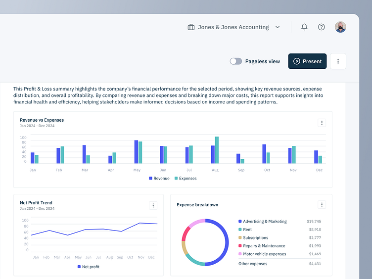
Revamp our client's financial reporting app to not only give their UX/UI a lift but to also include data visualization and Chart Templates into the layout (just a sneak peek - work in progress!)
💭 The challenge
The biggest challenge here (amplified by being linked to Reports and datagrids) was working on the data viz and charts in tandem with our devs. It's easy enough to design something pretty and awesome-looking, but when talking about financial Reporting, page sizes and print fitting, tables and charts that have data linked (filters, layouts...) a bunch of edge cases and scenarios come about: "this looks great, BUT... what happens when users XYZ?".
It's been really interesting and a learning experience to balance delightful, beautiful designs (especially when it comes down to data you visually "consume", the market is saturated with great competitor reporting apps) but to also be realistic and technically feasible when presenting proposals. The true essence of product design: make us something as nice or better than our competitors, but also don't give our devs a heart attack and waste anyone's time and money. A constant back and forth and an awesome collaborating exercise!
👨🏻💻 The outcome
Were super excited by what's coming out of this project - when a product's been running for years already, with thousands upon thousands of active users and a sea of user feedback, it becomes a pleasure to come in and help lift an already great product. Stay tuned for updates!
What do you think? 👀
Work with us!
UserActive is a product design agency for B2B SaaS. We’re on a mission to help SaaS Founders create meaningful products users love.
Book a call 👉🏼 www.useractive.io
