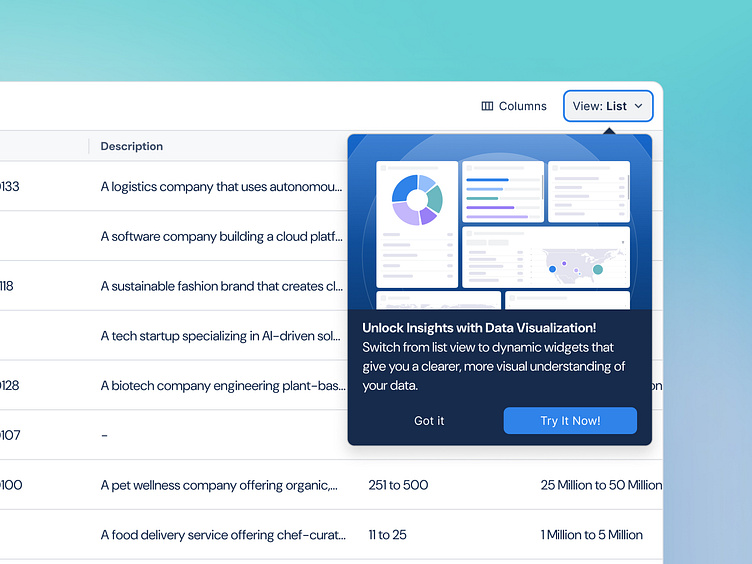
Feature Callout | B2B Outreach
General Rule for Feature Callouts in UI Design:
Use Visual Prominence: Implement visually engaging elements like illustrations or icons to capture the user’s attention without overwhelming the main content.
Be Clear and Concise: Provide a brief, compelling description of the new feature, emphasizing its benefits in a straightforward way.
Offer Immediate Action: Include an easy-to-access call-to-action (CTA) like “Try It Now” or “Learn More” to encourage user interaction with the feature.
Allow Dismissal Options: Offer a “Got it” or similar button to let users close the callout if they want to skip it, ensuring a non-intrusive experience.
This approach helps effectively introduce new features to users by making them noticeable, informative, and accessible.
Work with us!
UserActive is a product design agency for B2B SaaS. We’re on a mission to help SaaS Founders create meaningful products users love.
Book a call 👉🏼 www.useractive.io
