Observer responsive
This design is part of the responsive website layout for the Observer project.
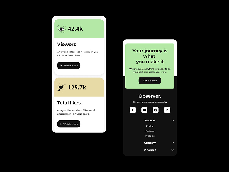
The left section showcases metrics like Viewers and Total likes, with cards that allow users to view analytics on engagement and earnings potential from their content. Each card also includes a “Watch video” button for further insights, adding interactive elements to the user experience.
The right section features a call-to-action with the message “Your journey is what you make it,” encouraging users to request a demo. Below that is a clean, minimal footer with social media links and navigation options, helping users access product information and explore different sections.
The design maintains a modern, professional look with soft color accents and bold text, optimized for easy navigation on smaller screens, ensuring a seamless experience across all devices.
⭐️⭐️⭐️
We’re always excited about new projects!
You can find our contact details in the About section of our profile.
