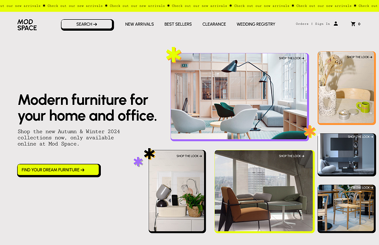
Hero section for a modern furniture store
30 Days of Web Design Challenge | Day 03
For day three of this challenge, I designed a hero section for a modern furniture store called ModSpace. I was heavily inspired by the neobrutalism design trend, as you can hopefully clearly see! I leaned heavily into the use of bold, black borders and lines, neon bright colors (used sparsely), and a clear grid structure for the imagery.
Thanks for checking it out!
To learn more about me and view more of my work, please visit my portfolio at amandabarmash.com.
More by Amanda Barmash View profile
Like
