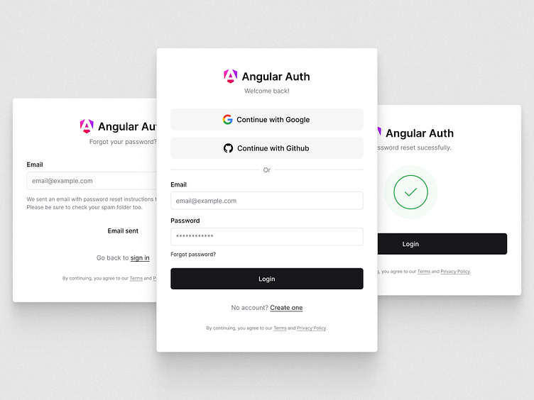
Login Authentication Screens – UI Design
This project includes only the login screens. If you’d like to see the register screens, they are available at the following link: Register Authentication Screens – UI Design
Pages included in this project:
- Login (sign in) screen
- Forgot password screen
- Reset password screen
OAuth Placement:
The OAuth options are positioned at the top of the screen on the desktop to prioritize visibility and align with standard reading patterns. On mobile, these options are placed at the bottom to optimize for ergonomic accessibility, allowing easier reach within the thumb’s natural range and enhancing the overall touch interaction experience.
Of course, in the real world, this is not an absolute truth. Testing is essential to determine the optimal placement for OAuth buttons based on user behavior and preferences, as different audiences may interact with the interface in varied ways.
Validation Messages:
Each page in this project includes validation messages designed to guide the user through the authentication process. To improve clarity and user comprehension, only one validation message should appear at a time. This approach ensures that users are not overwhelmed with multiple error messages simultaneously, making it easier for them to focus on the issue at hand.
Login screen
Forgot password screen
Reset password screen
Contact: ghfernandespro@gmail.com


