Application Redesign
Overview
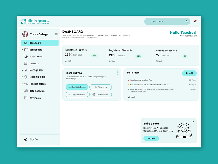
The goal of this project was to enhance the usability and aesthetics of a school digital platform's dashboard interface, used by teachers and school administrators. The platform provides real-time insights, messaging, and quick access to essential school management features. This case study showcases my redesign process, focusing on improving user experience, interface clarity, and visual hierarchy.
The Problem
The original dashboard design had several usability and visual issues:
Cluttered Interface: Key information was not prioritized, and users found it challenging to quickly locate essential tools or metrics.
Poor Visual Hierarchy: Similar colors and font sizes made it hard for users to distinguish important elements, resulting in cognitive overload.
Dated Look and Feel: The design didn’t reflect a modern or user-friendly aesthetic, which negatively impacted user engagement.
Limited Guidance for New Users: First-time users could find the navigation confusing, as there were few cues to guide them through the platform.
Objectives of the Redesign
Improve Information Accessibility: Structure content so users can instantly access key metrics and tools.
Enhance Visual Appeal: Modernize the interface to create a clean, professional, and engaging look.
Prioritize Key Actions: Design intuitive, easy-to-locate sections for the most commonly used features.
Simplify Navigation: Ensure a smoother and more intuitive navigation experience by improving visual hierarchy and reducing cognitive load.
Design Process
1. User Research and Pain Point Identification
Interviews and Observations: I conducted interviews with teachers and administrators to understand how they interacted with the existing dashboard. They emphasized the need for a quick overview of key stats and easier access to frequently used features, like sending notices.
Competitive Analysis: I examined other popular school management platforms to identify design trends and common UX patterns that enhance ease of use and engagement.
2. Defining Personas and User Stories
Primary Persona: A school teacher or administrator who wants a quick snapshot of school activity and access to communication tools.
User Stories:
“As a teacher, I want to quickly see how many parents and students are registered so I can gauge engagement levels.”
“As an administrator, I need reminders for critical tasks to stay organized throughout the day.”
3. Wireframing and Prototyping
Low-Fidelity Wireframes: I created wireframes focusing on content reorganization. I grouped related items (like student and parent counts) and added a “Quick Buttons” section for frequent actions.
Prototyping: Using Figma, I developed an interactive prototype to test user flows, ensuring that the primary actions were easy to access.
4. Visual Design
Color Scheme: I used a calming, modern color palette with soft blues and greens, giving the platform a more approachable feel. Green accents highlight active elements, while neutral tones maintain balance.
Typography and Iconography: Clean, accessible fonts and recognizable icons enhance readability and help users quickly identify sections.
Visual Hierarchy: I applied a clear hierarchy, using larger font sizes and bold text for key statistics and action buttons to prioritize what users need to see first.
Key Changes and Solutions
1. Dashboard Summary with Clear Metrics
New Feature: The redesigned dashboard provides a quick summary of key statistics such as "Registered Parents," "Registered Students," and "Unread Messages."
Impact: Teachers can now see vital stats at a glance, reducing the time spent navigating to different sections for updates.
2. Quick Buttons for Common Actions
New Feature: I introduced a “Quick Buttons” section featuring the most-used actions like "Compose Notice," "Register Student," and "Add New Event."
Impact: This minimizes the number of clicks needed for essential tasks, making workflows faster and more efficient.
3. Reminders Section
New Feature: A “Reminders” section with color-coded labels based on urgency (e.g., red for high-priority reminders).
Impact: Teachers and administrators are now more organized, with important tasks visibly listed on the dashboard to prevent missed deadlines.
4. User-Friendly Navigation and Branding
Design Update: I revamped the side navigation menu with updated icons and a more accessible layout. The user’s institution and role are also highlighted to reinforce a sense of personalization.
Impact: The new layout and personalization elements provide a seamless and friendly user experience, which contributes to greater user satisfaction and comfort.
Results and Learnings
The redesign resulted in a more user-centric dashboard that is both visually appealing and functional:
Increased Engagement: The streamlined access to key metrics and actions encourages users to engage more frequently with the platform.
Improved User Satisfaction: Positive feedback from users highlighted a smoother, more enjoyable experience with the updated layout and features.
Enhanced Navigation Efficiency: By prioritizing key actions and grouping related tasks, users reported a quicker, more intuitive workflow.
Learnings: This project reinforced the importance of balancing information density with usability. Through careful planning and user feedback, I learned how a well-structured layout and clear visual hierarchy can drastically improve user engagement and satisfaction.
Conclusion
This dashboard redesign exemplifies my approach to crafting user-friendly and visually engaging digital experiences. By focusing on user needs and modern design principles, I was able to create a more efficient, appealing, and intuitive interface that enhances the daily workflow for teachers and administrators on the platform.


