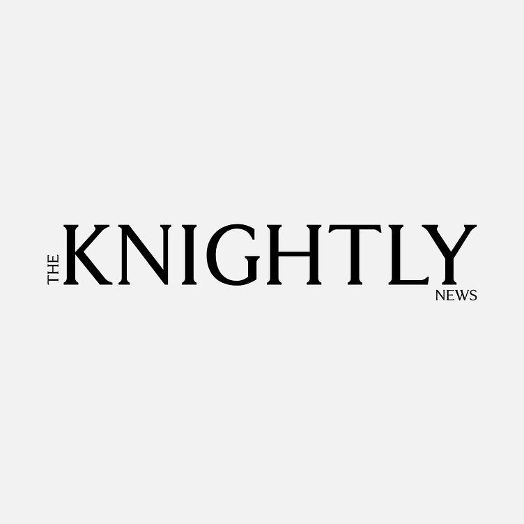
The Knightly News - Magazine Logo
Enter your text here...For this logo design project, my goal was to create a logotype that aligned with Burberry's brand, maintaining a refined and simple aesthetic while adding a sense of dynamism. I positioned the word "The" vertically, moving upwards, which creates a sense of movement and naturally draws the reader’s eye to it first.
The word "Knightly" is bold and large, placed at the center as the focal point of the magazine’s name. The word "News" is positioned at the bottom right of "Knightly," aligned with the "Y" of "Knightly," guiding the reader through the normal left-to-right reading flow, ensuring it’s the last element encountered.
The overall composition is simple yet fluid, offering an engaging and dynamic logo for the magazine.
