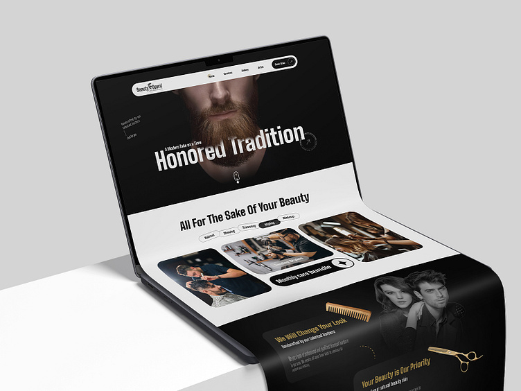
Barber Booking App Landing Page Design
Hello, Dribbblers!
Presenting our latest landing page design for a Barber Booking App – a sleek, stylish interface that captures the essence of traditional barbering with a modern twist. This design is created to resonate with users looking for quality grooming services, blending bold aesthetics with user-friendly navigation.
Design Highlights -
Hero Section: A bold, impactful header image showcasing a classic beard trim, paired with the tagline.
Service Offerings: Key grooming services like haircuts, beard trimming, shaving, and styling are prominently displayed with visuals, making it easy for users to explore options.
Client Gallery: A visual gallery of satisfied clients showcases the quality of work, helping to build trust and attract more users.
If you're interested in launching a similar app for barber bookings, explore our comprehensive guide on creating a reliable salon appointment app and our detailed take on salon app UI/UX design.
If you like the concept, press ❤️
Follow us to see more insights on:
aPurple | Facebook | Linkedin | Instagram | App Design | YouTube


