Carre Saint-Cyr - soft rebrand
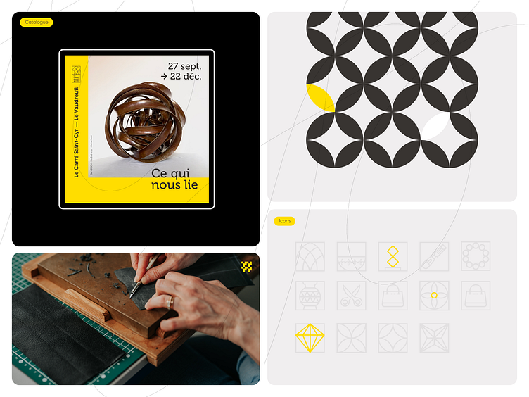
This branding board presents a visual identity concept for Carré Saint-Cyr, a former deconsecrated church that has been transformed into an exhibition space dedicated to showcasing artisanal craftsmanship.
The design emphasizes the theme "Ce qui nous lie" ("What binds us"), highlighting the connections between artisans, materials, and the heritage of craftsmanship. The key visual elements include:
1. Primary Imagery: The main image showcases an intricate, interwoven sculpture, symbolizing unity and the interconnectedness of the artisanal community. The clean, minimalist layout lets the artwork take center stage, paired with a strong, warm yellow color block that provides contrast and draws attention.
2. Pattern Motif: A geometric, circular pattern, suggesting harmony and repetition, is used as a branding element. This motif represents the cyclical nature of craftsmanship and the continuity of tradition and innovation within the space.
3. Iconography: A custom icon set is designed with a modern, clean aesthetic, incorporating elements associated with artisanal work. These icons support various applications of the brand and reinforce the connection to artisanal themes, such as cutting, weaving, and shaping.
4. Craftsmanship Detail: The imagery of hands working on leather conveys the hands-on, intimate nature of the crafts exhibited in Carré Saint-Cyr, adding a human touch that resonates with the artisanal mission of the space.
Overall, this branding approach combines modern design with traditional craftsmanship, celebrating the essence of Carré Saint-Cyr as a space where art and heritage intersect. The cohesive color palette, clean typography, and symbolic imagery together create an inviting, respectful, and inspiring visual identity for the venue.

