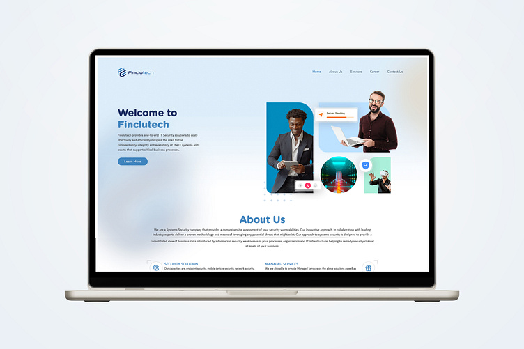
Fintech Website Mockup
Interactive Design
An Interactive Design theme for a fintech website enhances user engagement by making financial services intuitive and visually dynamic. Through animated data visualizations and responsive dashboards, it simplifies complex processes like budgeting and investing. This approach fosters trust and clarity, creating a personalized experience that guides users seamlessly through their financial decisions.
Metro Design Style
A Metro Design Style for a FinTech website brings a clean, modern, and grid-based layout to financial services, enhancing clarity and usability. Characterized by bold colors, flat icons, and intuitive tiles, this design style offers a streamlined interface that makes navigating financial tools and data effortless. With an emphasis on simplicity and quick accessibility, Metro Design is ideal for fintech, allowing users to engage with dashboards, transactions, and analytics easily, creating a user-friendly and visually cohesive experience that feels both professional and approachable.
Color Scheme
A carefully selected color scheme is essential for fintech branding, conveying trust, professionalism, and innovation. Popular options include blue and white, which together create a modern, clean look that evokes stability and reliability—ideal qualities for a financial brand. Green and gray pairings represent growth and sophistication, balancing vibrant energy with a polished feel. For an upscale look, navy and gold exude confidence and luxury, while teal and charcoal bring a fresh, innovative vibe with a touch of seriousness. A bolder choice like black and emerald combines sophistication and wealth appeal, perfect for reaching a younger, modern audience. Consistent use of these colors across the website, logo, and marketing materials strengthens brand recognition and builds lasting user trust.
Font Style
Using an imperfect font style on a fintech website can add a touch of warmth and personality, creating a unique contrast to the often sleek, structured look of financial platforms. However, it’s crucial to strike a balance, as readability and professionalism are key in fintech. Here, Gotham Round and Dubai fonts are used to achieve this effect. Gotham Round, with its slightly rounded, approachable style, softens the interface and works well in headings or feature callouts, making financial content feel more welcoming. Meanwhile, Dubai font provides a clean, modern look for body text, ensuring clarity and readability, especially in multilingual settings. When used thoughtfully, this combination humanizes the brand, giving it a friendly, accessible edge without compromising credibility.
Full Website View
A Fintech Services Website Mockup is a design concept tailored for companies offering innovative financial technology solutions. This mockup highlights a professional layout that effectively showcases the company’s services, such as digital payments, secure transaction processing, financial data analytics, and custom fintech software solutions. Key sections might include an overview of services, client testimonials, case studies, and a robust contact interface, all arranged to build credibility and trust. With modern design elements, secure data integration, and intuitive navigation, the mockup is designed to communicate expertise and provide a user-friendly experience that resonates with potential clients and partners in the fast-evolving financial industry.


