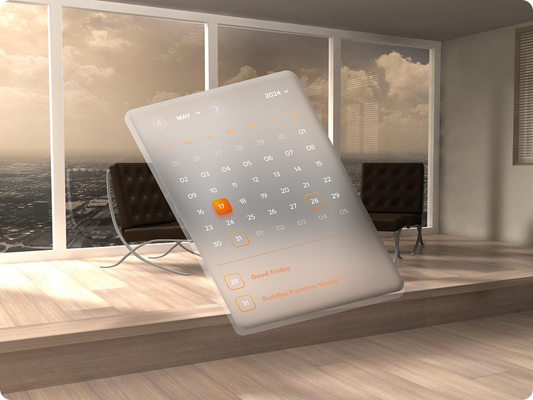
Day 38: Daily UI Challenge - Calendar UI 📅
Today's challenge was to design a calendar interface, so I went for a clean and simple layout!
Here’s what I focused on:
Highlighted days: The current day is marked in a bold orange highlight to make it stand out.
Holiday markers: Holidays are highlighted with an orange stroke around the date, along with a label showing what holiday it is, so users can quickly know when a special day is approaching.
Keeping it minimalist makes it easy to read and visually appealing without clutter. This UI is perfect for those who want an organized, simple calendar experience with a touch of color!
What do you think of this design approach?
#UIDesign #DailyUI #UXDesign #CalendarUI #MinimalDesign #UIChallenge #UXUI #ProductDesign #DesignInspiration #LinkedInDesign #OrangeHighlight #Holiday
