PARAMI CAFETERIA | LOGO DESIGN & BRAND IDENTITY
Parami Cafeteria was born with the mission of becoming an ideal book cafe, a place to connect souls who love coffee and are passionate about knowledge. Here, customers can immerse themselves in the rich flavor of coffee, blending with inspirational books in a quiet and relaxing space. Parami wants to bring peaceful moments, where each cup of coffee is not only a drink but also a companion on the journey of discovery, contemplation and relaxation in the hustle and bustle of life.
The Parami Cafeteria brand identity was designed by Bee Art with earthy brown and beige tones, inspired by the rustic beauty of nature and the warmth of the book cafe space. These two main colors create a friendly and relaxing feeling, inviting customers to enter a quiet world, where they can slow down, sip coffee and immerse themselves in good books.
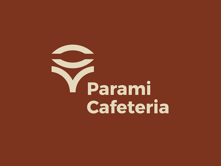
The Parami Cafeteria brand logo is delicately designed, combining the image of a book page and the eye symbol, evoking the concept of knowledge and insight. The two images of a book page and an eye, when combined, create the image of a sprouting tree, symbolizing the sustainable development and continuous discovery of the brand. Parami Cafeteria is a place to connect the passion for coffee and the love of knowledge. With a peaceful and cozy space, every corner of the shop is designed so that customers can enjoy each page of a book with a cup of strong coffee. Coming to Parami, you will find moments of relaxation and tranquility amidst the hustle and bustle of life.
-
Client Parami Cafeteria
Logo Design Project. Logo is designed for Coffee shop.
Copyright© Bee Art. All Right Reserved
Contact us:
• Hotline/ Zalo: (+84) 77 34567 18
• Email: info@beeart.vn
• Website: www.beeart.vn
• Facebook: https://www.facebook.com/BeeArt.vn


