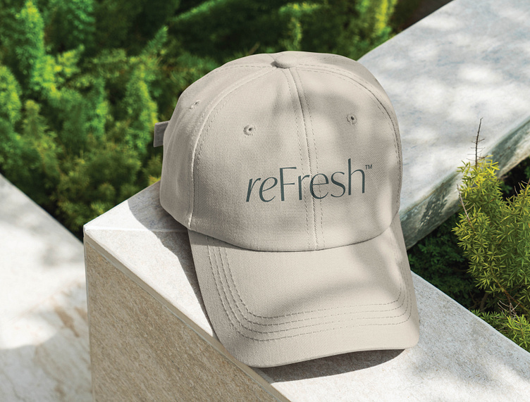
reFresh Logo Presentation
This logo redesign presentation was really special to me as Paula, the founder of reFresh has been a longtime friend and mentor of mine. Take a look at the beautiful brand created for this self proclaimed “Founder and Chief Executive Saunterer.” If you don’t already think she sounds cool, you should know she also rides a motorcycle. ⚡️
Our mission was to create a logo to reflect reFresh’s unhurried personality.
This type-only solution offers a modern style with a gorgeous nod to history. There’s a generous amount of white space in each letterform, giving us figurative room to breath and the feeling of an invitation.
The carefully balanced brand name is more than a standard font selection. The beginning of the word is italicized, offering a light emphasis and an interesting variation of both the “r” and the “e” (as they are used twice in “reFresh”). This approach was taken to emulate calligraphy.
I had three solid reasons to lean in to a calligraphic-rooted style: 1) its influence on reFresh from the beginning, 2) its connotation with human touch, or handwriting and 3) its consideration as an art form, a way to mimic The Creator.
Calligraphy artwork / Provided by client
Saint Francis of Assisi / Oil on canvas, by Giovanni Costa, Castle Howard Collection
The word “Calligraphy” comes from Ancient Greek “kalligraphía” which means “beautiful writing”.
The calligraphic influence shows up throughout the logotype, with irregularity in the characters. They vary in size, shape, and style, producing a distinct aesthetic.
The taper of the “e” and the flare of the “F’ are especially enjoyable.


