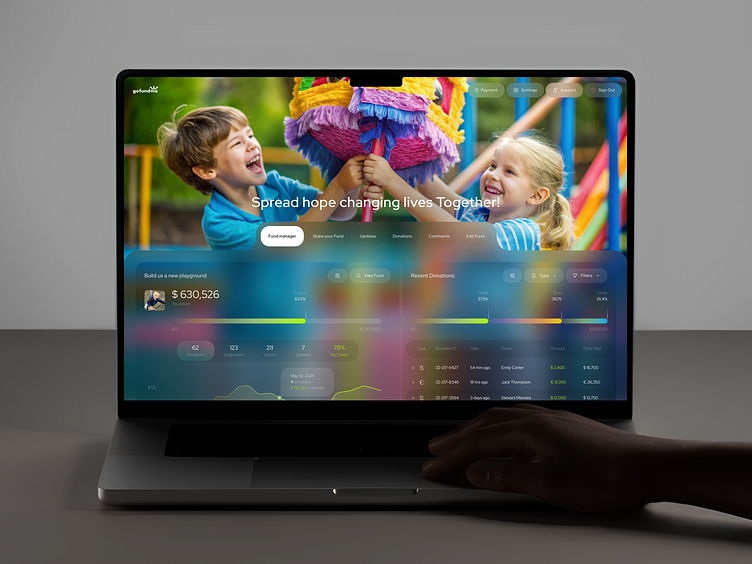
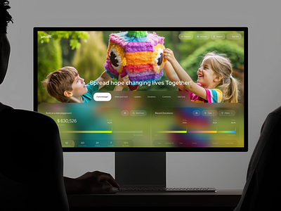
GoFundMe - Funding Web Dashboard
Client's Request
"Many users find existing crowdfunding platforms complex and hard to navigate, leading to poor engagement and support. We want to design a streamlined web platform for GoFundMe, making it easier to create, discover, and support campaigns with an intuitive, user-friendly interface."
About Project
GoFundMe Web Platform aims to simplify the fundraising process for both campaign creators and donors. The platform focuses on intuitive navigation, improving campaign visibility, and streamlining donations, making it easy for users to support causes that matter.
User Challenges
The existing platform struggled with an overly complicated campaign setup, poor discoverability of projects, and a confusing donation process. Users faced frustration navigating the interface, which affected campaign success and reduced donor participation.
Valuable Insights
Our research showed that 60% of users abandon campaigns due to a confusing setup process, while 45% of donors cite difficulty navigating the platform. Surveys revealed that simplifying campaign creation and improving donation flow could significantly boost user retention and engagement.
Project Result
As a result, we improved user flow, reducing campaign setup time by 40% and increasing project visibility by 30%. The simplified donation process led to a 25% rise in donor engagement, significantly enhancing both campaign success and user satisfaction.
Client's Feedback
"We’re looking to expand the project by developing a mobile version to ensure seamless usability across devices. Future plans also include integrating social sharing tools and personalized campaign recommendations for users."


