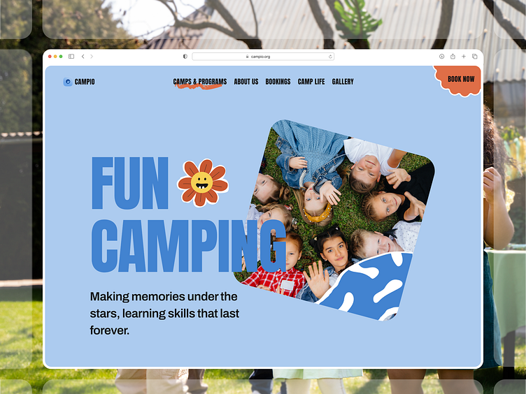
Campio - Kids Adventure Landing Page 🏕️
Hey Dribbble! 👋
Excited to share this playful landing page design for a kids' camping website. The goal was to create a fun and trustworthy interface that appeals to both kids and parents while maintaining a clean, modern aesthetic.
Design Highlights:
• Cheerful blue colour palette paired with warm orange accents
• Custom playful flower mascot adding personality
• Real photography showing authentic camp experiences
• Modern typography balanced with playful elements
• Clean navigation with clear CTAs
• Rounded corners for a friendly, approachable feel.
The hero section uses a creative split layout combining bold typography with candid photography of kids having fun at camp. The curved photo frame adds a playful touch while maintaining visual hierarchy.
I hope you enjoy it and press "L" if you like it. Do you have any feedback or comments? Feel free to leave your comments below.
💌 Have a project idea? We are available for new projects.


