A New Look For The iBook
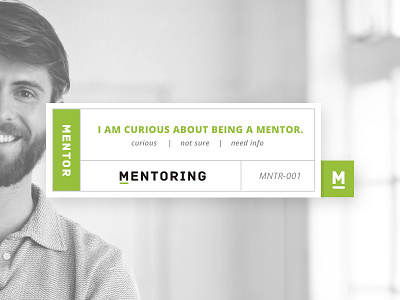
So I was sitting there looking at my original design, and I decided I didn't like it. I didn't think it had enough personality. There wasn't enough for people to connect to.
I'm starting to like this version. I like the overlay and the subtle light shining through the dark image.
Thoughts?
More by Adam Trybuła View profile
Like


