Revolutionary eCommerce App UI Design – Sleek & User-friendly

ABOUT DESIGN

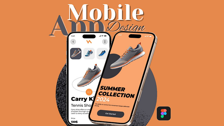
This is my latest UI/UX design concept for a shoe shopping app, created using Figma. The goal of this app is to offer a seamless, intuitive, and enjoyable shopping experience for users looking for a variety of shoes, whether for fashion, sports, or everyday wear.

Key Features & Design Goals:

  1. User-Centered Experience: The design is focused on making the shopping process as smooth and simple as possible. I’ve prioritized clear navigation, intuitive categorization, and an engaging UI to keep users focused on their shopping journey without distractions.

  2. Elegant & Clean UI: The app features a modern, minimalistic design with a bright color palette and spacious layouts to create a premium feel. I used bold imagery to showcase the shoes and allow users to clearly see the product details with high-quality visuals. The typography is clean and easy to read, contributing to the overall simplicity of the design.

  3. Easy Product Discovery: The home screen is designed to immediately capture attention with a large, engaging product carousel and dynamic filters, making it easy for users to browse different shoe categories. Users can filter by brand, size, color, style, or activity, and even see trending products.

  4. Smooth Checkout Flow: I’ve focused on streamlining the checkout process with minimal steps and clear instructions. The cart is always accessible, and users can quickly add products with a single tap. The payment and shipping details are presented clearly to minimize friction during the purchase process.

  5. Interactive Prototyping (Figma): To ensure a smooth user experience, I created interactive prototypes in Figma, allowing users to click through the app as if it were a real product. This includes smooth transitions between screens, such as selecting a product, adding it to the cart, and proceeding through the checkout process.

  6. Responsive Design: The design adapts seamlessly across multiple devices, ensuring a consistent experience whether the user is shopping on a phone, tablet, or desktop.

Tools Used:

  • Figma for wireframing, prototyping, and high-fidelity design.

  • Unsplash for free high-quality shoe images.

  • Google Fonts for modern, web-friendly typography.

Challenges: One of the challenges I faced was balancing aesthetics with functionality. I had to ensure the design was visually appealing without overwhelming the user with too many choices. I also wanted to make sure that the app would work well across various devices and platforms, so I spent a lot of time iterating on responsive layouts and micro-interactions to create a polished final product.

Feedback & Collaboration: I’d love to hear your thoughts on this design! If you have any suggestions, feel free to comment. I’m always open to feedback and collaborations on similar projects.

video tutorial

In this video tutorial, I walk you through the complete design process of creating a shoe shopping app from scratch, using Figma. Whether you're a beginner or an experienced designer, this tutorial covers essential UI/UX design techniques that you can apply to your own projects

Why This Tutorial is Useful: This video provides a step-by-step guide to designing a fully functional and aesthetically pleasing shoe shopping app in Figma. I break down each design phase and share practical tips on how to overcome common design challenges, such as balancing visual appeal with usability. Whether you're designing for e-commerce, fashion, or retail, the techniques covered in this tutorial will help you create apps that are both user-friendly and engaging

About Video

Here is the demonstration of mobile application design for shoes brand

Typography:

Monterest font is used in this design

Main Heading size : 16 (font size)

Sub Heading : 12. (Font size)

More by MAAZ UI Designer

View profile