People Nearby Chat UI Design
Feature People Nearby Chat
Location-Based Connection:
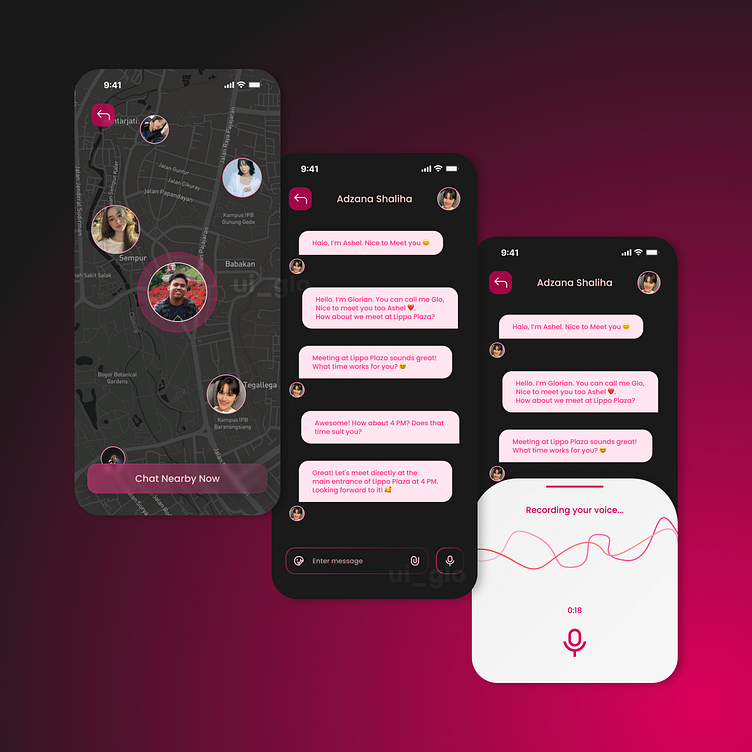
The first screen shows a map with profiles of nearby users, emphasizing the app's purpose of connecting people within close proximity. This visual cue immediately informs users that they can discover people around them, creating a sense of proximity and connection.
The "Chat Nearby Now" button is prominently displayed at the bottom, encouraging users to initiate conversations with others in their vicinity. Its color and size make it easy to spot and invite interaction.
User Profile Highlights:
Profiles are displayed as icons or avatars on the map, making it easy to see potential chat partners at a glance. This approach provides a quick understanding of who is nearby and accessible for a chat.
Selecting a user on the map likely initiates the chat or opens their profile, creating a seamless transition from browsing nearby profiles to active conversation.
Chat Interface:
The chat screen has a clean, minimalist design, focusing on message bubbles that enhance readability. User messages are displayed in contrasting colors, with pink and red hues that make it easy to differentiate between users, adding a sense of personality and warmth.
The header shows the other user's name and profile picture, helping users keep track of their chat partner, which is especially helpful in a nearby chat context where they may interact with multiple people.
Intuitive Interaction Options:
There’s a text input bar with an icon for sending text messages and a microphone icon for sending voice messages, giving users flexibility in how they communicate. These familiar icons make it easy for users to understand how to interact without additional guidance.
The microphone button is easily accessible, allowing quick voice message recording, which enhances communication, especially in scenarios where typing might be inconvenient.
Voice Message Recording:
When users press the microphone button, they see a dedicated voice recording screen. This screen shows a dynamic waveform to indicate recording in progress, as well as a timer, which provides clear feedback that the app is actively capturing audio.
The design is simple, with a clean background and a central microphone icon, creating a distraction-free interface for users to record their messages.
Visual Design and Color Scheme:
The dark-themed background with pink and red highlights gives the app a modern, trendy feel, appealing to young and social users. The color contrast between the background and interactive elements (buttons, text bubbles, etc.) makes it easy to navigate, even in low-light settings.
The color choices also evoke a sense of warmth and friendliness, which enhances the experience of connecting with nearby people.
Encouraging Engagement:
The design flow from the map to the chat screen and voice recording is intuitive and focused on engagement, reducing friction between discovery and communication.
The app uses engaging visual elements like the map and profile pictures to encourage users to connect, while the clean chat interface keeps them focused on their interactions.


