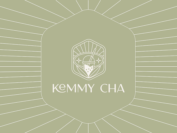
KEMMY CHA | LOGO DESIGN & BRAND IDENTITY
Kemmy Cha coffee and tea brand was born with the mission of bringing customers special flavor experiences from cups of coffee and tea. Kemmy Cha aims to connect people through every moment of enjoyment, creating a comfortable, inspiring space. With a commitment to using natural and quality ingredients, the brand not only brings delicious drinks but is also associated with a healthy, environmentally friendly lifestyle.
The Kemmy Cha brand identity designed by Bee Art uses two main color tones, green and pink, to create a fresh, dynamic and approachable image, in line with the natural and youthful spirit of the brand. Green symbolizes freshness and closeness to nature, while pink brings a warm and attractive feeling, creating a harmonious whole, helping the brand easily leave a mark in the hearts of customers.
The Kemmy Cha brand logo is delicately designed with the image of a cup of milk tea to represent the brand's main business product. In addition, the logo is also used in combination with small details such as a 4-pointed star and surrounding "radiating" lines to show radiance, energy and prominence, conveying a message of quality and reliability.
-
Client Kemmy Cha
Logo Design Project. Logo is designed for Coffee shop.
Copyright© Bee Art. All Right Reserved
Contact us:
• Hotline/ Zalo: (+84) 77 34567 18
• Email: info@beeart.vn
• Website: www.beeart.vn
• Facebook: https://www.facebook.com/BeeArt.vn


