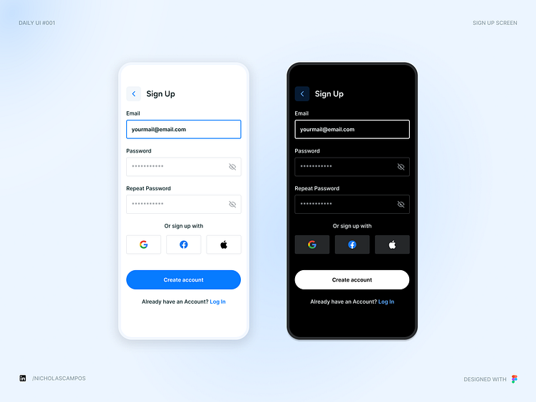
Daily UI 001 - Sign Up Screen
Clean & Minimalistic Sign Up Screen Design - Light & Dark Modes
Here's my take on the Daily UI Challenge #001 – a Sign Up screen designed with usability and aesthetics in mind. This design showcases both light and dark modes, offering flexibility for user preference. With options to sign up using Google, Facebook, or Apple, the interface prioritizes easy access and simplicity, all crafted in Figma.
Follow me for more UI/UX designs and insights into clean, user-friendly mobile interfaces!
If you’re interested in my work, connect with me on LinkedIn to stay updated on my latest projects and design insights!
More by Nicholas Campos View profile
Like
