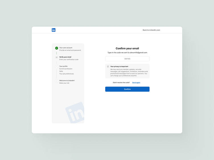
Redesign of LinkedIn’s Login Flow
Excited to share my take on redesigning LinkedIn's login flow! 🚀
I focused on creating a seamless, intuitive experience that helps users set up their profiles effortlessly.
The journey starts with a mapped-out roadmap, guiding users through each key step with clarity. I’ve added a verification step early on to strengthen security and give users confidence right from the start.
In the Select step, users choose a category to align with their directions, helping LinkedIn better tailor connections and content. To make setup even easier, a toast notification suggests uploading a CV, which an AI can then use to fill out their profiles automatically—a big time-saver, especially for busy professionals!
Finally, the upload process takes place in a clean, focused modal that shows progress, ensuring users feel in control as they’re guided through the flow.
This redesign prioritizes simplicity and speed, helping users dive into LinkedIn with minimal setup friction. Can’t wait to hear what you think of these improvements!
Let me know if you like it 🫰🏼


