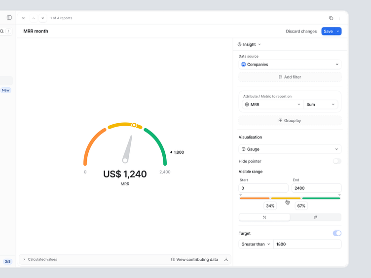
Attio – Reporting Gauge visualization Exploration
A while back we've explored a few concepts on gauge visualizations for our powerful reporting feature. This is still a in progress concept but wanted to share what we've came up with. The user is able to set custom visible range, define the areas and what the target is e.g. less is best vs. more is best vs. exact is best. Based around that the color coded areas are generated.
—
New to Attio?
We firmly believe that business-built software is the future. That means giving end-users the power to simply and quickly configure their tools so that they work perfectly for them. Notion, Airtable, and Zapier are leading the wave and now we’re bringing it to the largest business software category: CRM.
Want to see more updates in the future? Follow us on Dribbble and Twitter.

