Contact Us & FAQ Section
Contact Us & FAQ Section
💬 Approach & Concept
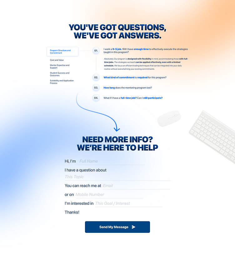
This design prioritizes ease of use and a welcoming tone to make traders feel comfortable reaching out and finding answers on their journey to mastering trading. By combining a sleek, modern layout with intuitive navigation, we’ve built a resource that invites users to engage without overwhelm. The clean visuals and iconography reflect professionalism, while the soft colors and friendly emojis create a warm, supportive vibe.
🖌️ Key Design Elements
Intuitive Layout A simple yet organized structure allows users to easily locate either contact or FAQ options—no clutter, no confusion.
Vibrant Call-to-Action We’ve used a standout CTA for the Contact Us section to prompt action while feeling approachable. Clear, rounded buttons add a friendly touch!
Organized FAQ Categories FAQs are grouped into relevant categories, helping users quickly find answers to their most pressing questions. Each question is expandable for seamless interaction.
Modern Color Scheme 🎨 Soft, modern colors paired with sharp fonts balance approachability with credibility—perfect for a mentorship-focused platform.
🧭 User-Centric Benefits
By blending simplicity with warmth, this design aims to reduce friction and encourage users to reach out or explore FAQs with confidence. Our mentorship program is about support and guidance, and this design reflects that, helping users feel they’re in good hands every step of the way! your text here...
